

Tutorial: Create Gold Jewelry with Photoshop, Part One
Originally Published August 2010
A few weeks ago, I featured the work of Photoshop wizard Nathan Smith. Nathan creates images that seem to contain lots of hand-wrought gold filigree and gorgeous shiny gemstones, all against a brilliantly colored fractal backdrop. (That crude description doesn’t do his work justice. You really need to see it for yourself. His gallery is here.) As I mentioned in that article, Nathan has provided some nice tutorials on his Deviant Art page, showing how he performs his miracles.
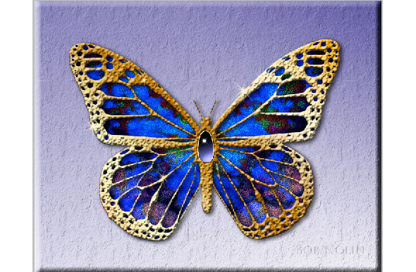
I decided to try my hand at it, and quickly realized the man makes it look easy. The butterfly, above, is one of my first attempts to create something using his methods. Eventually, I hope to put this to work creating jewelry for characters in paintings. As a man, I am handicapped when it comes to painting ladies in evening gowns, wearing all kinds of jewelry everywhere. I know nothing about this stuff (just ask my wife!) I figured Nathan’s tutorial was a good place to start.
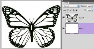
To start, find or create some good hard-edged line art. By that I mean, you’ll want clean edges, not jagged and rough. Line art that originates in Adobe Illustrator or the free open source program Inkscape is a perfect, though you can also create it within Photoshop, using the pen tools. Photoshop can import vector art, converting it to bitmaps. I exported the following from Inkscape, at 300ppi. High resolution helps, too. Keep in mind that all this line work is going to become gold filigree in a just a bit. The smoother the lines and curves, the better. You can also use good quality clip art. Just be aware that if you scan something, it’ll most likely need cleaning up. Zoom in at 200% or more and check the edges. You can download the butterfly line art and follow along.
Since we’re going to be using Layer Styles, our black and white art needs to be on an empty layer (see above). The surprising part of Nathan Smith’s method, to me, was that the shiny gold in his images starts out as black. Once you have your art on an empty layer by itself (not surrounded by white or other colors, that is), just the art and the checkerboard pattern, you’re ready to go. In the Layers palette, click on the icon at the bottom that looks like “fx”, or double click on the layer itself. This opens the layer styles palette. Here’s what it will look like when we’re done. Notice the check marks on the left side. By clicking on the name of each of these items, the middle area changes, so you change the settings for that item.

When the Layer Styles dialog first comes up, usually the main “Blending Options: Default” is active. We won’t be changing anything here. Click on the words “Gradient Overlay.” This changes the middle area to the gradient overlay dialog. It also puts a checkmark next to “Gradient Overlay” for you. If you decide you don’t want this gradient overlay stuff later on, you can just uncheck it, and the effects here are cancelled. But you do want to see some gold, so let’s leave it on. Let’s take a look at the middle area.

The only option we’ll change here is the gradient. Click on the little triangle next to the gradient, and a drop-down of your currently-loaded gradients appears. None of the delivered gradients create a gold effect, so we’ll have to make it. Double-click right on the gradient image itself, and the gradient dialog opens.

See those colored squares (stops) running underneath the gradient? That’s what you change here, nothing else. To start, click and drag the existing stops away, and they are deleted. You’ll be left with two, one on far left, one on the far right. When you click on a stop, the color drop-down below is activated. Click on the color there to get the color picker. Change it to a color similar to what I have here. Add stops in-between by clicking once in a blank area under the gradient; change the color of each as you go. It’s not easy to understand at first, but trust me, it does make sense after a while. Once you have something resembling the gradient shown above, click okay, and you’re returned to the Gradient Overlay. You’re done here, too, so click on Ok, to see the result so far. Your black and white line art should look something like this. (Keep in mind that the white is on a separate, bottom layer. The artwork and layer effects are on an empty layer above the white layer.)

Double-click on the word “Effects” over in the layer palette, to bring up the Layer Effects dialog again. Next we’ll add that crinkly look. (I know nothing about jewelry, so laugh all you want, you jewelry people!) In the left-side column click on the words “Bevel and Emboss.” Change the settings to match the screenshot below. The result should look like what you see here. Sort of like stamped gold foil. (I hear you people laughing and I’m ignoring you.)

Okay, time for the crinkly part. Stay on the Bevel and Emboss dialog. Notice the Texture option sort of nested below? Click on the word Texture. In this Texture dialog, click on the drop-down there in the middle. You should see a list of textures. (If not, click on the triangle to open the Load dialog, and go find your texture files.) You can use any of the standard textures that come loaded with Photoshop. Try them out and see how they affect the gold surface. Find one that looks “real” to you (I thought mine looked good, but what do I know?). Set the scale to 75% (though you can adjust that for different looks). Set depth to +100%. Here’s what it should look like now.

Well this is certainly turning into a long tutorial! I’ll need to break this into two parts, I guess. Let’s look at one more thing: the wing color. Next week we’ll create the jewel and the setting. To create the color, I used a combination of texture files. The main was Textures_121_by_Inthename_Stock on Deviant Art. Here’s the link to their page. I mixed it with a layer of deep blue, and then combined the layers. Then, I set the layer blend mode to Linear Light, which I’ve never used before. It works great for this! Put the texture on a layer below your artwork, and it will appear in the holes, like stained glass. Use your eraser or a layer mask (the better way) to remove all of it except what’s behind the gold. Here’s the color layer by itself, so you can see what it looks like.

You can find part two here

