

Mar 05, 2024
Mastering the Rules of Composition in Photography for Stunning Images
When I think about the photographs that stay with me—the ones that pull me back for a second or third look—it almost always comes down to composition. Light, subject, and color matter, of course, but without thoughtful composition, even the most interesting subject can fall flat. That's why the rules of composition in photography are not just theory—they're tools I return to every time I step behind the camera. In fact, composition in photography is closely connected to the broader world of visual arts, such as painting, where both rely on compositional guidelines to arrange visual elements and tell a compelling story.

What I love is that these rules aren't there to restrict me; they're there to guide me. Mastering these compositional guidelines is essential for developing strong photography skills. And sometimes, breaking them is the very thing that makes an image work. But before you can break them, you have to know them. Let's walk through some of the key rules of composition and how they shape stronger, more impactful photographs, helping you create attractive composition that draws the viewer in.
Understanding the Building Blocks of Photography Composition
Photography composition is essentially how all the elements inside the frame work together. Lines, shapes, colors, textures—they each have visual weight, and how you place them changes the story your image tells. Compositional lines, such as horizontal, vertical, and diagonal lines, play a crucial role in arranging elements and influencing the overall balance and flow of the image.
Saturation doesn’t just change colours—it shifts mood, depth, and meaning. If you want to see how subtle or bold those changes can be, take a look at my guide on what is saturation in photography.
Visual Weight and Balance: Some elements dominate naturally—bright colors, sharp contrasts, or large shapes. Horizontal lines often contribute to a sense of stability and calm, while vertical lines can suggest strength or tension depending on their placement. Balancing these lines with quieter spaces, or what we call negative space, helps keep the viewer's eye moving comfortably across the frame and can introduce visual tension or harmony.

Negative Space: Empty space isn't wasted space—it gives breathing room, adds calm, and makes the subject more powerful. Negative space also helps direct the viewer's focus, ensuring attention is drawn to the most important elements.

The Golden Ratio: This timeless compositional tool adds a sense of harmony and proportion that feels natural to the human eye, whether we're aware of it or not. Human beings are naturally attracted to harmonious proportions, which is why the golden ratio is so effective.
 Curved lines can guide the eye naturally through the frame, creating a smooth flow and enhancing the visual journey for the viewer.
Street photography is storytelling at its most spontaneous—where light, character, and urban poetry collide. If you want to explore what defines the genre, take a look at my piece on what is street photography.
A clear focal point, or obvious subject, helps guide the viewer's focus and provides a center of interest around which other elements are balanced.
When considering color, understanding color theory is essential for selecting harmonious combinations and creating visually striking compositions.
Visual Elements: The Language of Photographic Design
Every great photo starts with the careful arrangement of visual elements—the true language of photographic design. These elements, from lines and shapes to textures, patterns, and colors, are the foundation of all strong photography composition. Mastering how to use them is essential for applying photography composition rules and creating images that are both visually appealing and emotionally resonant.
Lines are among the most powerful compositional elements. Whether it's the strong, straight edge of a building, the gentle curve of a shoreline, or the subtle path of a shadow, lines guide the viewer's eye through the frame. Leading lines, in particular, are a perfect example of how you can direct attention straight to your main subject or focal point. Diagonal lines add dynamic tension and energy, making the final image feel more alive and engaging.
Negative space—those areas of empty space around and between your subjects—plays a crucial role in photo composition. Far from being wasted, negative space gives your main subject room to breathe, helping to simplify the scene and draw the viewer's attention exactly where you want it. It's a powerful way to create balance, especially when you're working with multiple elements or a busy background.
Visual weight is another key concept in photographic composition. Some elements naturally carry more visual weight—think bold colors, large shapes, or areas of high contrast. These can easily become the focal point, so it's important to balance them with quieter, less dominant areas. This balance is what keeps the viewer's eye moving comfortably across the image, rather than getting stuck in one spot.

Classic composition rules like the rule of thirds and the golden ratio are invaluable tools for arranging these visual elements. By placing essential elements along grid lines or at key points, you create a more harmonious and interesting composition. The golden ratio, with its naturally pleasing proportions, can help you achieve a sense of balance that feels just right to the human eye.
In the end, understanding and intentionally using visual elements is what transforms a snapshot into a great photo. By applying composition rules—using leading lines, embracing negative space, and balancing visual weight—you can create images that not only capture attention but also hold it, guiding the viewer's eye and telling your story with clarity and style.
Classic Principles of Composition
There are a few compositional rules I find myself teaching and using over and over again, because they work across genres—from landscapes to portraits to street photography.
Rule of Thirds: By dividing the frame into nine equal rectangles, you create a grid that helps guide the placement of key elements. Placing a subject at one of the points where the lines intersect often creates a more dynamic and visually pleasing composition, and positioning the horizon or major subjects along a horizontal line can enhance balance. Placing the subject off-center, rather than in the middle, usually results in a more attractive composition.

Leading Lines: Streets, fences, rivers, even shadows—all of these can guide the viewer's eye toward the subject, creating movement and depth in the frame. In landscape photography, leading lines often converge at a single vanishing point, using linear perspective to draw the viewer into the scene.

Balance and Contrast: Think of composition like a scale—you want the viewer's eye to move comfortably without being pulled too hard in one direction. Use balance elements, such as grouping two elements for contrast or three elements for a dynamic triangular composition, to create visual equilibrium. Contrast can then be used to emphasize what matters most.

Framing: Using natural frames—like windows, arches, or tree branches—draws the eye inward and strengthens focus on the subject. Including a foreground, middle ground, and background with varying distances adds depth and dimension to your images.
Using a zoom lens can help you fill the frame, sometimes leaving little or no space around the subject for greater impact.
A good example of these principles is a portrait with negative space that draws attention to the subject. An excellent example is a landscape photo where the horizon sits on a horizontal line, the main subject is placed off-center at a point where lines intersect, and layers at varying distances create depth.
These rules aren't about perfection; they're about connection. They help ensure that nothing in the frame feels accidental.
The Power of Visual Storytelling
Photography is storytelling with light and form, and composition is the language that makes it clear. The rules of composition in photography allow us to deliberately guide a viewer through an image. Composition directs the viewer's eye and holds the viewer's attention on the primary subject, ensuring the main focal point stands out.

Think of leading lines pulling the eye down a winding street, or symmetry and patterns that lock attention in a rhythm. These techniques enhance visual interest, making the story more engaging and drawing the viewer deeper into the scene. The rule of thirds might make a portrait feel balanced, while filling the frame with details can create intensity and intimacy.
Each choice shapes how the story is read, and each decision is an opportunity to add emotion or meaning. Using shallow depth can isolate the primary subject and simplify the background, while black and white photography can emphasize composition by focusing on light, shadow, and texture. Sometimes, breaking the rule of thirds and other rules can enhance storytelling and create a more powerful image.
Composition Techniques Worth Practicing: Leading Lines
Here are some composition tips based on foundational compositional guidelines that I encourage every photographer to experiment with regularly:
Simplify the Scene: Simplicity is often underestimated, but it’s one of the most powerful rules of composition in photography. A cluttered frame can overwhelm the viewer, scattering attention and diluting your message. By stripping away distractions—whether that’s a messy background, competing subjects, or even excessive color—you allow the main subject to breathe.
Think of it as visual editing before you even press the shutter. Step closer, adjust your angle, or wait for the moment when the scene naturally clears. The result is an image where the subject speaks with clarity, its voice amplified by the silence around it.
Simplicity doesn’t mean emptiness—it means intentionality. Negative space, minimal detail, or a lone subject against a clean background can often tell a story more powerfully than a busy composition. When you embrace this principle, your viewer isn’t forced to hunt for meaning; it’s delivered with impact, right where it belongs.

Fill the Frame: Filling the frame is a rule of composition in photography that immediately adds drama and presence to an image. Instead of letting your subject get lost in the wider scene, you move in close—sometimes uncomfortably close—until the subject dominates the viewfinder. The effect is bold, intimate, and undeniably impactful.
This technique works beautifully with textures, faces, and architectural details, where every line, wrinkle, or surface becomes part of the story. A close-up of weathered wood, for example, reveals character you might miss in a wider shot. A portrait framed tightly around the eyes carries an intensity that lingers.
The danger of leaving too much empty space around your subject is that it can dilute the image. By filling the frame, you remove hesitation and create immediacy. The viewer has no choice but to engage directly with the subject. It’s photography stripped of distraction, where details aren’t just noticed—they’re felt.

Experiment with Viewpoint: One of the most exciting rules of composition in photography is changing your viewpoint. Too often, we default to shooting at eye level—but perspective is what transforms the ordinary into something extraordinary. Tilt your camera upward to exaggerate scale, crouch low to make small details dramatic, or find a high vantage point that compresses a scene into patterns and shapes.
Shooting through something—a window, a fence, a doorway—adds layers that can frame your subject and create intrigue. These shifts in perspective aren’t just gimmicks; they alter the way your viewer experiences the photograph. What feels flat at eye level suddenly becomes alive when seen from a fresh angle.
The next time you’re photographing, force yourself to capture at least three different viewpoints of the same subject. It’s often the unexpected one—the one you almost didn’t take—that becomes the image with the strongest story.

Play with Depth: Depth is what turns a flat image into something immersive. One of the most effective rules of composition in photography is to layer your scene with foreground, midground, and background elements. This layering creates a sense of three-dimensionality that draws the viewer in, making them feel as though they could step right into the frame.
Foreground objects can serve as an anchor—something close and tangible that immediately engages the eye. The midground carries the main subject, while the background provides context or atmosphere. A landscape without depth often feels like a postcard; add a strong foreground element, and suddenly the scene feels alive and expansive.
This principle isn’t limited to landscapes. In portraits, including a background that tells part of the subject’s story, adds richness. In street photography, depth comes from capturing multiple layers of human interaction in a single frame. It’s about giving your viewer pathways through the picture, not just a flat surface to look at.
Try the Diagonal Line and Golden Triangles: Draw a diagonal line from one corner of the frame to the opposite corner, then add two lines from the remaining corners to the diagonal. This divides the frame into golden triangles, providing dynamic compositional guides for positioning elements and enhancing visual impact.

Explore Horizontal Symmetry: Horizontal symmetry is one of those rules of composition in photography that instantly calms the eye. When both halves of an image mirror or balance one another, the viewer feels a sense of stability and harmony. Think of a mountain perfectly reflected in a still lake, or a city skyline mirrored in glassy water—scenes like these are powerful precisely because of their symmetry.
Reflections are the most obvious way to achieve this, but horizontal symmetry can also be found in balanced landscapes, architecture, or even staged portraits. When the elements above and below an imaginary center line carry equal visual weight, the result is both grounding and captivating.
The beauty of symmetry is that it doesn’t always need to be perfect. Sometimes near-symmetry—where one half almost mirrors the other—creates even more intrigue, inviting the viewer to look closer. Horizontal balance tells the brain that everything is in order, but it also leaves room for subtle surprises if you choose to break the symmetry intentionally.
The beauty of these techniques is that they're flexible. They can be subtle or bold, and they work across genres.
Aspect Ratio and Composition
The aspect ratio—whether you're shooting 4:3, 16:9, or square—also changes how rules of composition apply. A wide aspect ratio gives room for sweeping landscapes, while a square frame demands a tighter balance.
No matter the format, the rules remain useful. Use the grid lines on your camera as a visual guide, whether applying the rule of thirds or experimenting with the golden ratio.
The Creative Side: Knowing When to Break the Rules
Here's the thing: once you internalise these rules, you start to sense when to break them. The vast majority of photographers follow the rules, but creativity often comes from doing all that is necessary to serve the story, even if it means breaking them.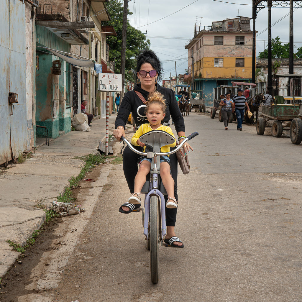 That's where creativity really takes off. A perfectly centered subject might be more powerful than one placed on a third. A chaotic, unbalanced frame might communicate tension better than harmony.
Composition rules are there to serve the story you're telling—not the other way around.
Final Thoughts
Mastering the rules of composition in photography is less about memorizing formulas and more about training your eye to see. They're there to help you create balance, add depth, and guide attention. But they're also there to be challenged, bent, and even ignored when the moment calls for it.
I’ve always believed that a single line—like ‘There are no rules for good photographs; there are only good photographs’—can reshape how we see our art. For more photographer quotes that inspire, check out my post on inspiring visions: 22 impactful photographer quotes.
At the end of the day, the real goal is to make images that feel alive—photographs that draw people in, hold them for a while, and maybe even make them see the world a little differently.


